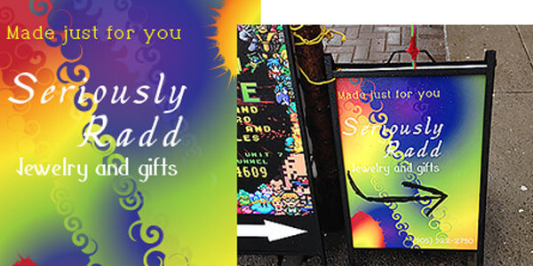
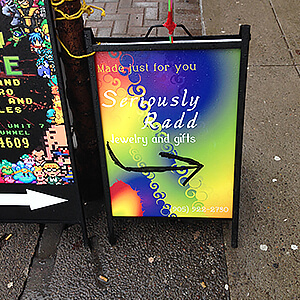
LOCAL GIFT STORE- SERIOUSLY RADD
My job was to create a store front sign and welcome
greeting card on the counter when you walk in.
I handled the printing dealing with the concern of materials for outdoors and
indoor signs.

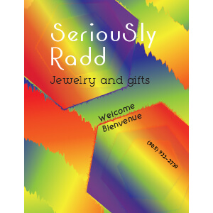

My client only had one branding
rule: rainbow colours as her scheme. That in itself was a challenge with having
such a large colour scheme. Finding a font and colour to contrast so many bright
colours was a challenge. Black, white or grey were the choices of colours I had
in mind. Finding the right display font for the mood and contrast considerations
took a while. It was unexpected that my client also used american spelling, a
mistake quickly corrected.
I handled the printing dealing with the concern of materials for outdoors and
indoor signs. It was my first time dealing with larger prints and I ended up learning that a print shop can print on pretty
much anything as long you bring the imagery.